For the Love of Photography
Overview
The theme of the project is to create a Digital Storytelling Online Application. Hence, I created PICI - a fictional photo sharing social media platform
The concept for the website is to create a space where individuals can share their passion and love for photography.
User Research, UX/UI design and Usability Testing were the main focus for this assignment.
Tasks
Brand DesignCreating PersonaUser ResearchUI & UX designWireframingPrototypingUsability Testing
Tools
Adobe XDAdobe PhotoshopProcreate
Brand Design
Brand Identity and Audience
Intended audience for this website comprises individuals aged between 30 and 60 years.
The website's concept revolves around creating a space for people to share their passion for photography. Whether you are a novice exploring photography as a hobby or a dedicated medium format enthusiast, this platform is designed to connect you with like-minded individuals who share your interests.
Mood Board
User Research
A qualitative research study was carried out using an online survey (Google Form), and all participants in the interviews fell within the specified target audience age range of 30 to 60 years. There was a total of 8 responses recorded.
The aim of the research is to find out how my audience undertakes tasks online, which includes:"
Signing Up and Logging In
Uploading content
Writing a story
Reading and browsing existing stories
Sharing existing stories or stories the user has created
1.Love Automatic Login and Facebook
For adults aged 30-40, Facebook remains the top social media choice, in contrast to younger audiences like Gen Z and millennials. About 62.5% of adults surveyed prefer Facebook as their most-used platform. Additionally, many users appreciate the convenience of automatic login through web browsers or phone applications, enabled by stored account information, ensuring seamless and effortless login experiences.
2.Posting Online is not the First Option
While socializing is crucial, half of the interviewees avoid uploading content online, emphasizing privacy and preferring online browsing. Meanwhile, 25% share hobbies, and another segment shares daily life content. The percentage decreases to 12.5% for those writing and sharing personal stories, as well as for sharing stories created by others.
IRL Interaction > Digital Socialising
When questioned about not sharing content, many participants cited a lack of motivation or simply not wanting to bother, despite the ease of the sharing process; discussions with interviewees revealed that these motivations often don't resonate with those who refrain from online sharing, as they find worth in aspects like family or career and prefer real-life interactions over social media.
Summary
Based on our interview findings, we discovered that photos are the preferred type of media content. As a UX designer, our task is to identify the essential "needs" that prompt users to engage with the product we design.
During the design process, our focus will be on users' love and passion for photography, emphasizing the visual aspect of photos rather than text elements like comments or captions. This approach aligns with user goals and emphasizes usability and user experience objectives.
After conducting the research interviews, I was able to create personas, scenarios, taxonomy, and design goals. These were based on the valuable insights acquired from the participants.
Design Goals
Interface Design
Easy Navigation
Comprehensibility
Responsive Design
Informative yet Uncluttered
Clean and Minimalistic Design
Functionality
Enhance User Options
Streamline Task Processes
Prioritise Simplicity
Facilitate User-Connectivity and User-Interaction
Effective Feedback Display
Paper Prototype
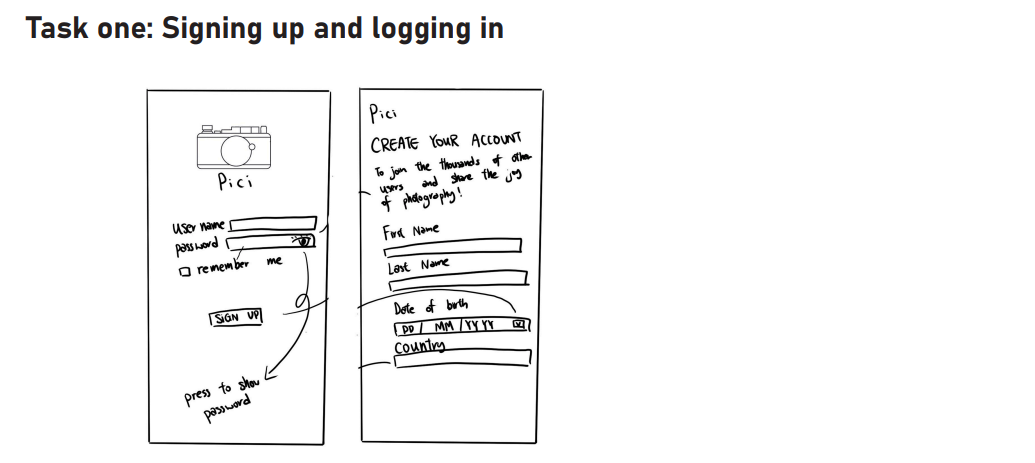
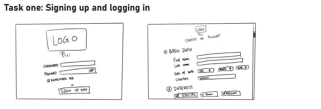
Paper prototype of the application was developed in two different designs on both Desktop and Mobile platforms.Each design focused on 5 tasksSigning Up and Logging InUploading ContentCreating ContentReading, Searching or Browsing Existing ContentSharing Existing Content or Content the User has Created or Found
Design 1
Mobile
Desktop
Desktop
Design 2
Mobile
Think Aloud Session
During a trial involving six testers assigned various tasks for two designs, feedback was collected through follow-up questions after each task, with testers providing ratings for each design based on individual tasks
Desktop
Creating Content is complicatingEquipment page is overloaded with informationLimited Options for Sharing other’s content
Result for Design 1
Mobile
Average Rating of 8Clean and Simple Design of the home pageEasy NavigationTasks were perceived as smooth completion
Desktop
Result for Design 2
Mobile
Average Rating of 9 on Mobile and 9.5 on DesktopGreat Layout and Component PositioningEasy NavigationUsers do not feel overwhelmed; low cognitive loadVisually comfortable; easy on the eyes
Similarity Between 'Sharing' and 'Post' Buttons Might Cause ConfusionLacking Options for Uploading Content
High-Fidelity Prototype
The prototype was developed using Adobe XD, with a specific focus on facilitating the completion of the same five tasks that were assessed during the "Paper Prototype" phase.
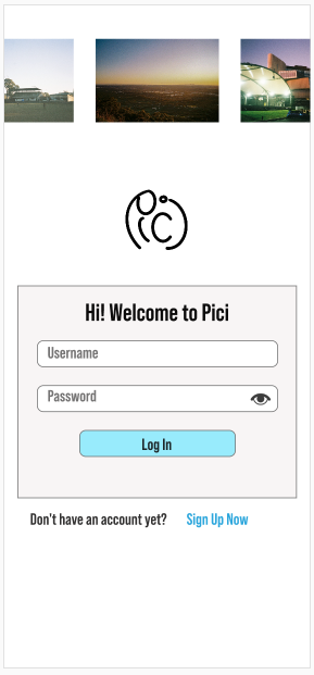
Desktop & Mobile - To sign up or log in, users can click the 'Sign Up Now' hyperlink, leading them to the sign-up page. While entering information, users can click the eye icon to view their password, serving as an error-prevention measure.Task 1: Signing-Up and Logging-In
Task 2 : Uploading Content
Desktop - Uploading content is very straightforward. Users start the process by selecting the 'Plus' icon in the top right corner of the home page, then proceed to upload photos by either drag-and-drop the files straight into the box or press the 'Upload Files from PC" button. Mobile - Like the desktop version, on the mobile version, users initiate the process by tapping the 'Plus' icon located at the bottom right corner. This action leads them to their phone's gallery, where they can easily select photos by tapping on them, and a 'tick' will appear at the top right corner of the chosen photo.Task 3: Creating Content
Desktop & Mobile - Following the photo upload, users can create a post by pressing the 'Next' button. They are then able to edit the post, including photo order, adding a caption and location, editing the equipment used, and Viola! The post has been created!Task 4: Browsing Content
Desktop & Mobile - To explore various posts on their home page, users can scroll up and down. Accessing another user's profile is as simple as tapping on their icon. Additionally, users can view the equipment used by other users on each post.Task 5: Sharing Content
Desktop & Mobile - Sharing others' content is easy—users simply press the 'Share' button beneath the post. They have various options to choose from, including sharing with friends on PICI, reposting, copying the link, or sharing on other social media platforms.Final User Testing
4 participants within the target audience age range tested the prototype, completing tasks with recorded time duration. Follow-up questions were posed after each task for further insights.
Desktop
Mobile
The Desktop version was being tested first. Tasks 4, 5, and 6 (Exploring Content, Sharing Content, and Browsing a User’s Profile) took under 3 seconds on average, while the remaining three tasks were completed in under 8 seconds. For Mobile, the average time for each task is lower than that used on the desktop version, it is likely because participants already have an understanding of how things work on the website.Recommendation
Overall, participants are pleased with the final design. However, three out of four suggested enhancing the aesthetic appeal by adding some color to the icons or logo.
Design Rationale
The primary objective is to maintain simplicity and comprehensibility. Given that the target audience falls within the 30-40 age range, their preference is for straightforward interfaces without the need to grapple with new technology or face confusion while navigating the platform.PICI prioritizes usability in its design. The layout is intentionally kept simple and avoid unnecessary embellishments.In terms of layout, I aim to incorporate the use of white space. This approach serves to distinguish different sections and enables users to focus on one element at a time. This aligns with my design principle of presenting information on the screen in a clear and organized manner.The platform's design predominantly features a monochrome palette, utilizing varying shades of black and white. This choice aids in layering different elements and guiding users in terms of navigation, helping them prioritize specific sections effectively.Conclusion
This has been the most enjoyable experience in my UX design journey. Although I've identified a couple of flaws while creating this showcase, it has surpassed my last few projects.Looking back on the whole process—from building the application and brand from scratch to conducting user interviews and research—it feels incredibly rewarding.There is always room for improvement and I'm eager to bring what I have learned from this assignment to my next project!


